Creating a visual identity to blend technology and humanity
Timeline
Spring 2023 (8 weeks)
My Role
I completed all deliverables for the project on my own, with weekly critique from my professor and classmates.
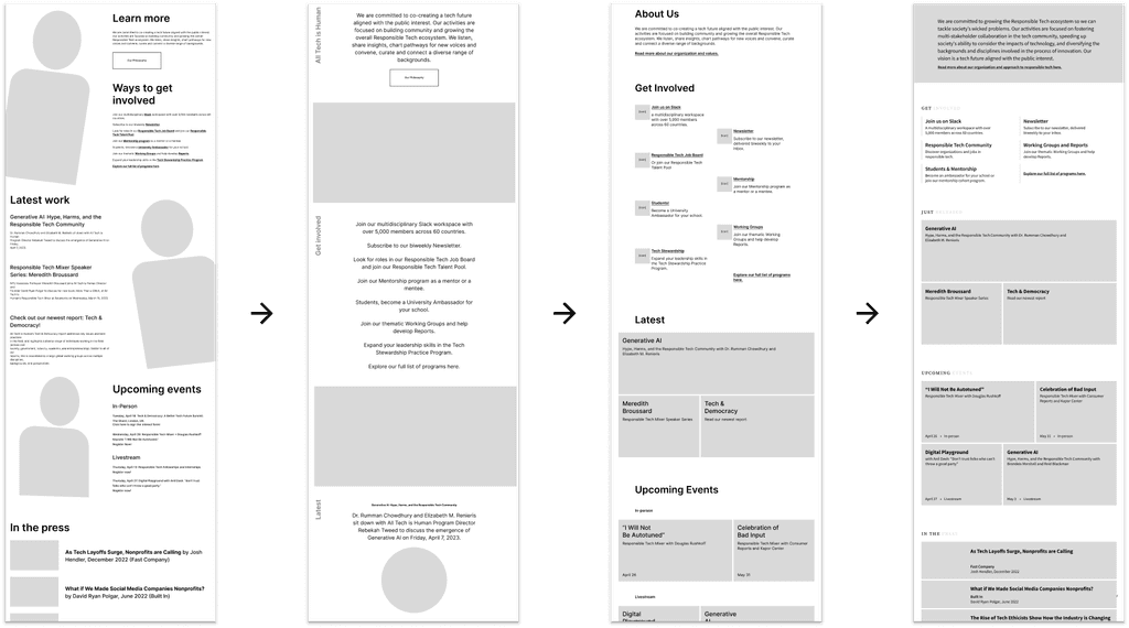
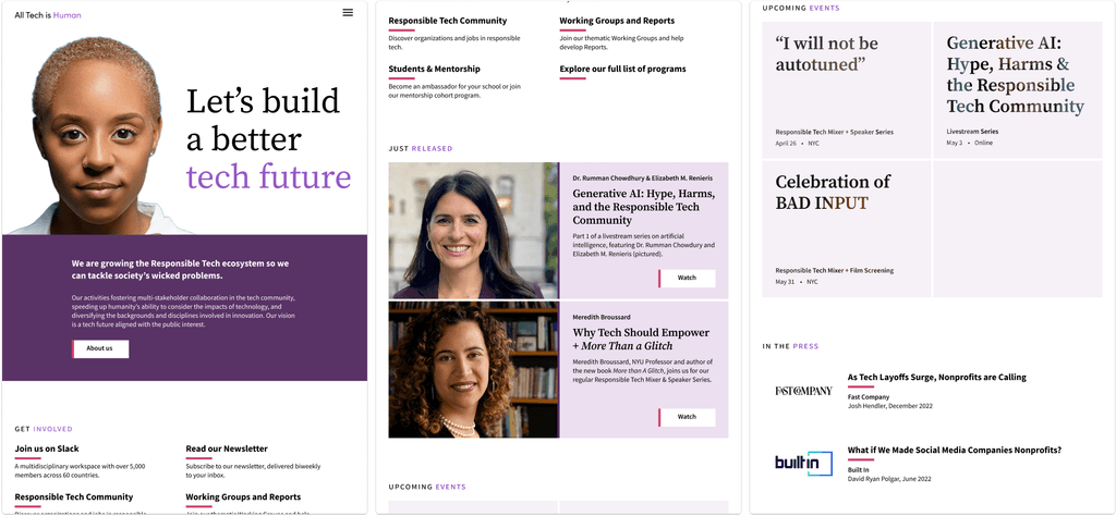
Left (before): All Tech is Human’s actual home page when I began the project
Right (after): My redesign of the home page.
Context
In their own words, All Tech is Human “brings together people, organizations, and ideas to tackle wicked tech & society issues and co-create a tech future aligned with the public interest.”
As part of a master’s course, I redesigned their visual identity from the ground up to give a nod to the refined aesthetic of modern technology while preserving the humanness of their brand.
Project and deliverables
I created a new visual system for All Tech is Human including a logo, color palette, typographic hierarchy, layout, and imagery.
I applied this system to their website (desktop and mobile) and created templates for social media use. I also created a 28-page brand book documenting usage rules and examples.
Impact
My visual redesign of All Tech is Human is meant to be more cohesive, intentional, and refined. If they were to implement the changes, the new look should increase their perceived credibility in the tech sector by aligning with the industry’s aesthetic while keeping humanity at the center of their brand.
Identifying areas for improvement
All Tech is Human engages with leading figures and companies in technology, but unlike the meticulously crafted and highly intentional brand aesthetics of Big Tech, All Tech is Human’s current visual identity fell short of communicating the same level of authority.
The current site was busy, with multiple graphic and typographic themes competing to display information, making it a bit overwhelming to newcomers and fans alike.
I did not address overall information architecture of their website in my project, but I looked for visual ways to streamline the experience of interacting with their brand online and make it easy for people to become inspired to get involved in their cause.
How can All Tech is Human’s visual identity better reinforce its values while adding credibility to the organization’s work?
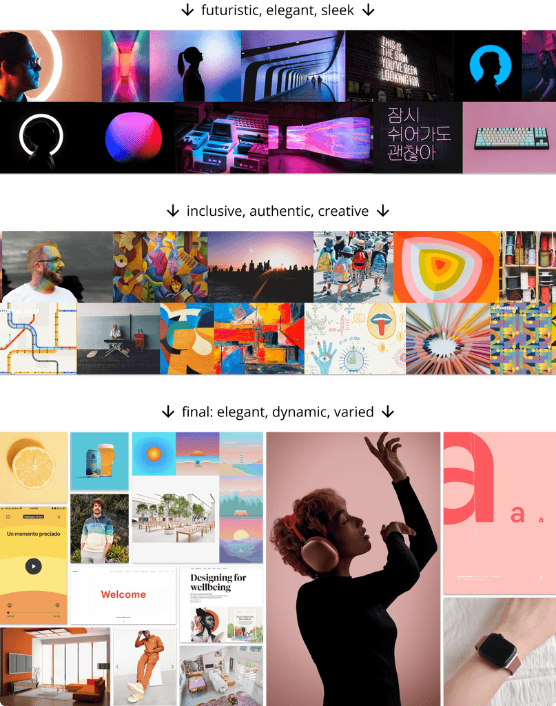
Moodboards: finding the right feel
I started my process with a few iterations of moodboards aimed to unite the concepts of “tech” and “human.” Sometimes it was too much tech, other times it was too much human. I pondered themes such as elegant, dynamic, varied, sleek, modern futuristic, inclusive, authentic until I found the right balance with my third iteration.
Flexible layout for a variety of content
Through several rounds of critique and iteration, I defined a grid system and layout based on tiles, paving the way for prominent imagery. I designed the tile layout to be flexible and modular to accommodate the several types of content on the site at different viewport sizes.
Modern typography with a human touch
For typography, I wanted something that looked clean and modern enough for a typical tech website, but with a bit more personality and humanistic variation in the letterforms.
I chose Adobe’s Source superfamily, using Source Sans for body text and headings, while Source Serif was reserved for large headings to leave a strong impression with a nod to human creativity.
Logo Design
I experimented with different pictorial logos, but ultimately decided to stay simple with a color-accented wordmark. For the type, I chose Sofia Pro for an elegant, modern look and feel, leaving the “humanness” to be emphasized by the color of the word.
Exploring color
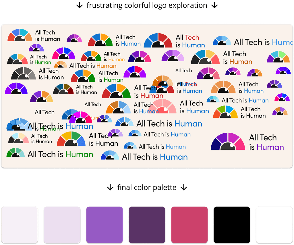
Color was a an interesting challenge—and it helped me decide to move away from a pictorial logo. I decided on purple to create a sense of complexity and to stand out from the sea of reds and blues.
However, finding secondary colors was difficult. In order to keep the palette subtle and cohesive, I chose three secondary shades of purple (moving the hue slightly towards red) and a red accent color to indicate interactive elements on the page.
Emphasizing imagery
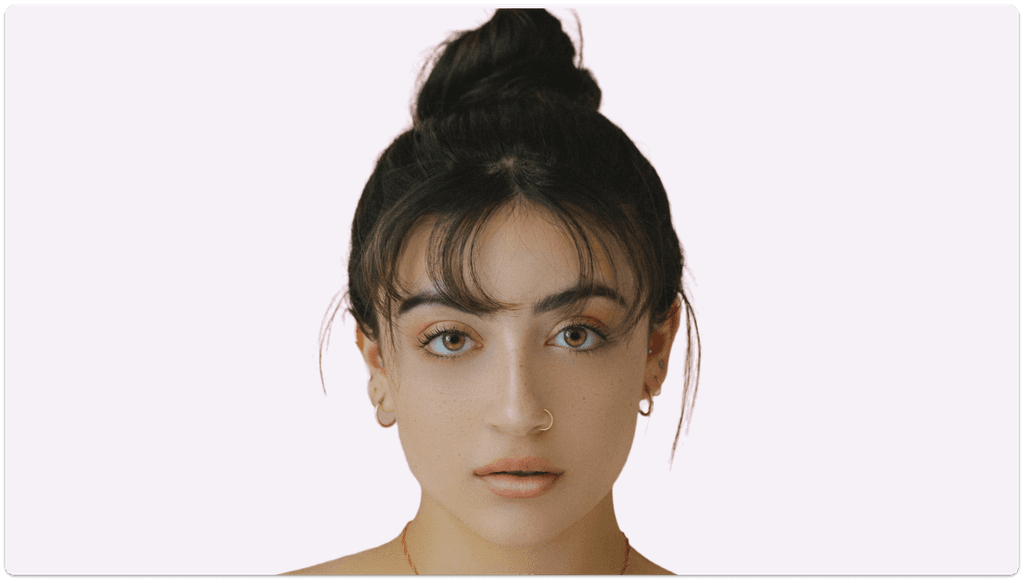
Through exploration and iteration, I became confident that imagery needed to be the main event for this visual system; nothing else could capture humanity like people. Drawing on poignant uses of portrait photography in branding and storytelling, I chose large, close-up images of humans with special emphasis on the eyes. This breaks uniformity to avoid sterility in the tile layout, while fostering empathy and a sense of gravity about the work of the organization.
Challenge: balancing several images at once
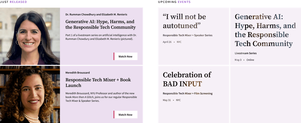
While I was immediately happy with the use of large images in the hero sections of different web pages, I had a hard time arranging smaller photos to accompany content in a way that still felt cohesive. My solution to this was to mask some images with text, creating a “sneak peek” at some images without having too many competing for attention.
Different tile designs helped control the number of images on the page while maintaining a cohesive feel.
Final visual system
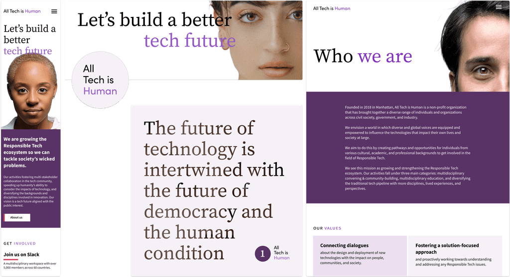
During the 8 weeks of this course, I focused on implementing each element of the visual system one at a time. The end result was a cohesive system that I applied to All Tech is Human website (desktop and mobile) as well as their social media.
My redesigned All Tech is Human homepage on desktop.
Additional visual assets applied in mobile, web, and social media contexts.
Documenting the system
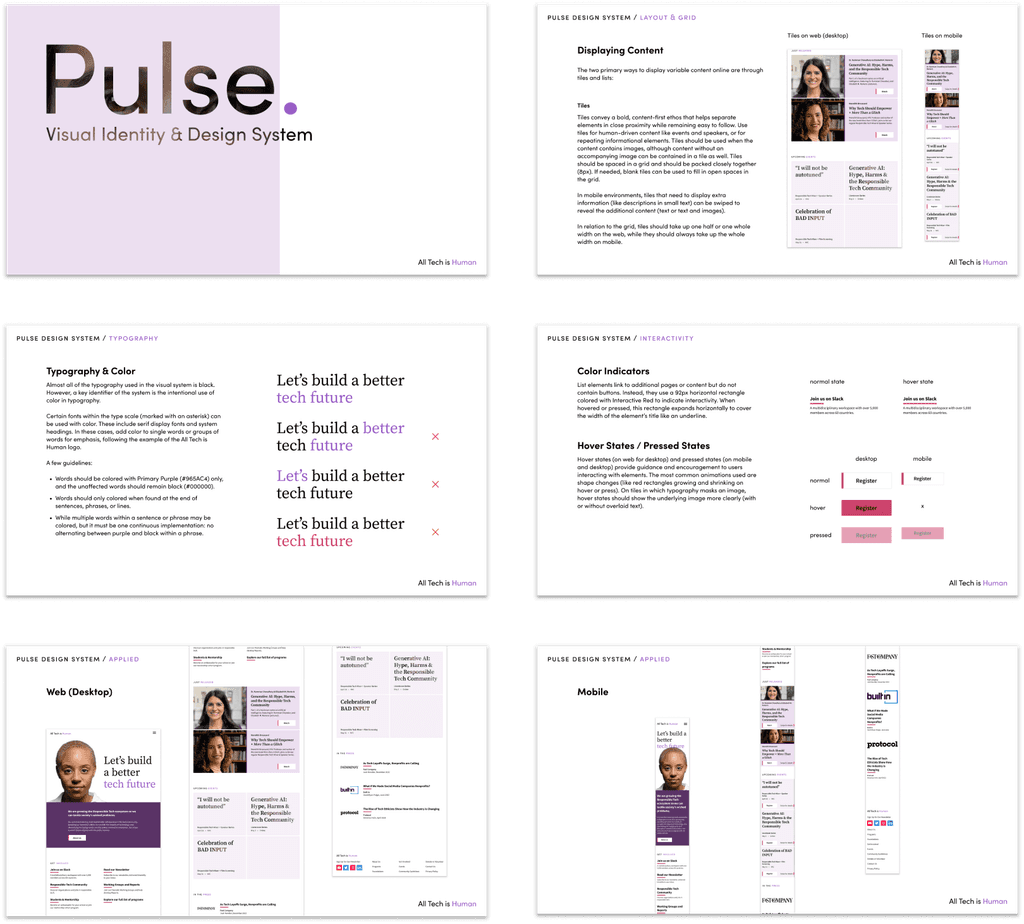
My final deliverable was a 28-page brand book detailing guidelines and examples for the visual system, which I named Pulse. This included implementation instructions for the system across platforms and rules for interactive elements.
Excerpts from my final brand book explaining visual themes and proper implementation.
Reflection
This project taught me so much about balancing visual different elements in order to create a cohesive experience, and that creating something simple and effective can be extremely difficult. Throughout the process, I learned to give and receive critique from other designers (my classmates), to explain detailed rationale behind decisions, and not to get too attached to any one idea.
