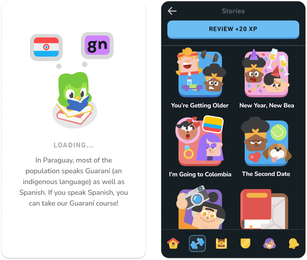
Making language learning more inclusive of diverse international audiences
Timeline
Spring 2020 with periodic updates
My Role
I completed this project by myself, doing my own illustration, typography, and UI design based on Duolingo’s design language.
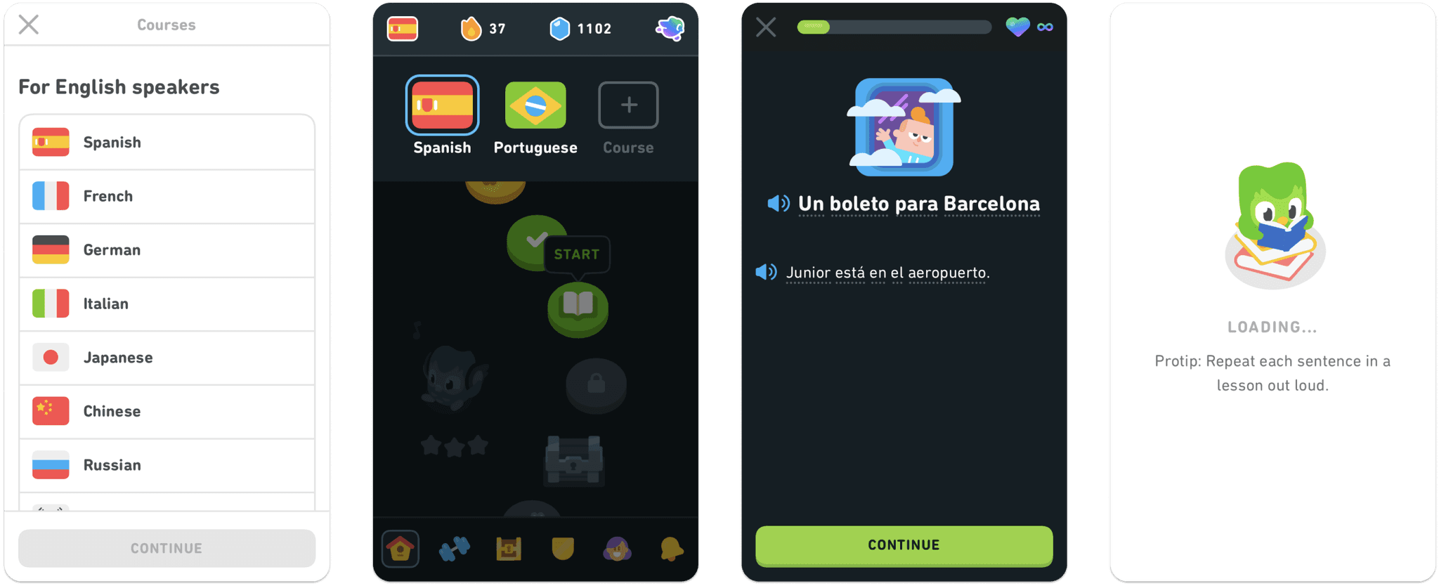
Current
Redesigned
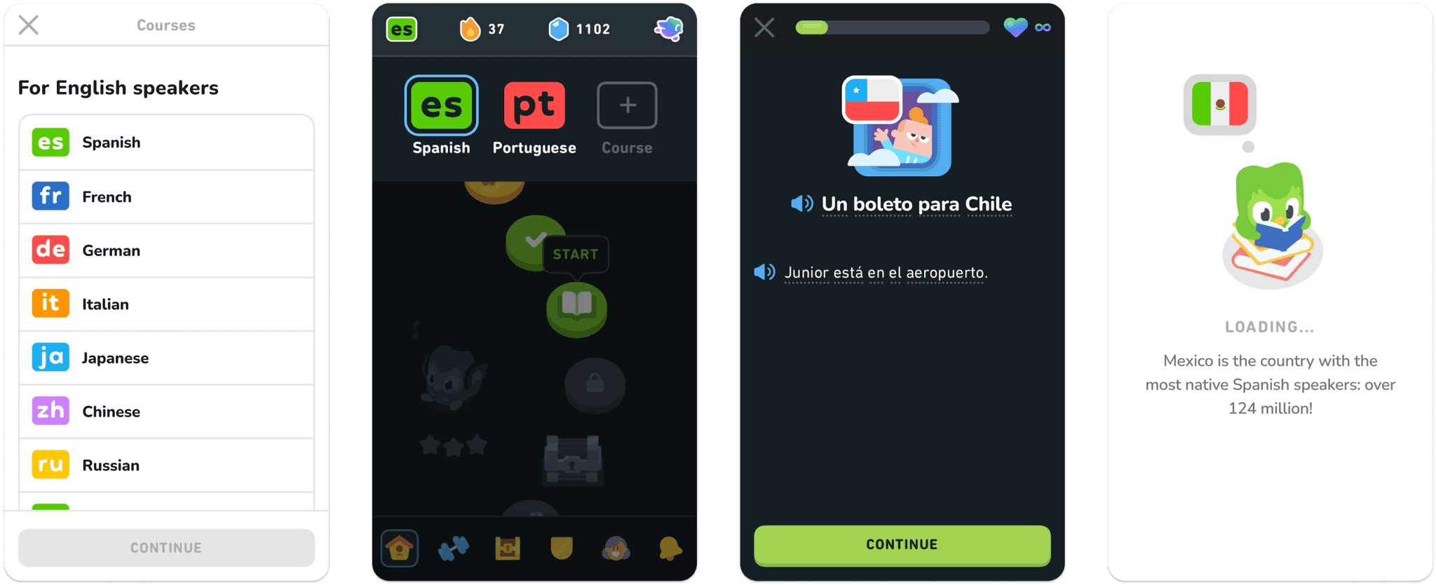
Context: not all Spanish speakers live in Spain
Through its use of flags to represent languages, Duolingo’s current interface emphasizes certain countries and erases others.
Having noticed this as a longtime user of Duolingo, I started this project to look for ways for flags to highlight diversity rather than minimize it.
Project and deliverables
I created a strategy for more inclusive flag use throughout Duolingo’s platform by:
Creating typography-based decorative assets to represent language courses instead of flags.
Illustrating more flags and outlined ways to use them to enhance country-specific cultural references in course content.
Impact
The typographic representation of languages ends the exclusion and erasure of certain countries while reducing confusion about the dialect taught.
The use of flags to accompany country-specific cultural references increases representation and highlights the diversity of multinational language speakers.
These solutions, while hypothetical, could be implemented almost immediately, with minimal effort, and with opportunities to expand their scope over time.
Languages ≠ flags
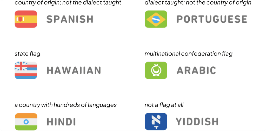
Duolingo, the most popular language-learning platform in the world, has long represented it’s course with little flags. But the way it assigns flags to languages does not (and cannot) follow any logical system, because languages and flags are complicated.
This creates problems: netnography
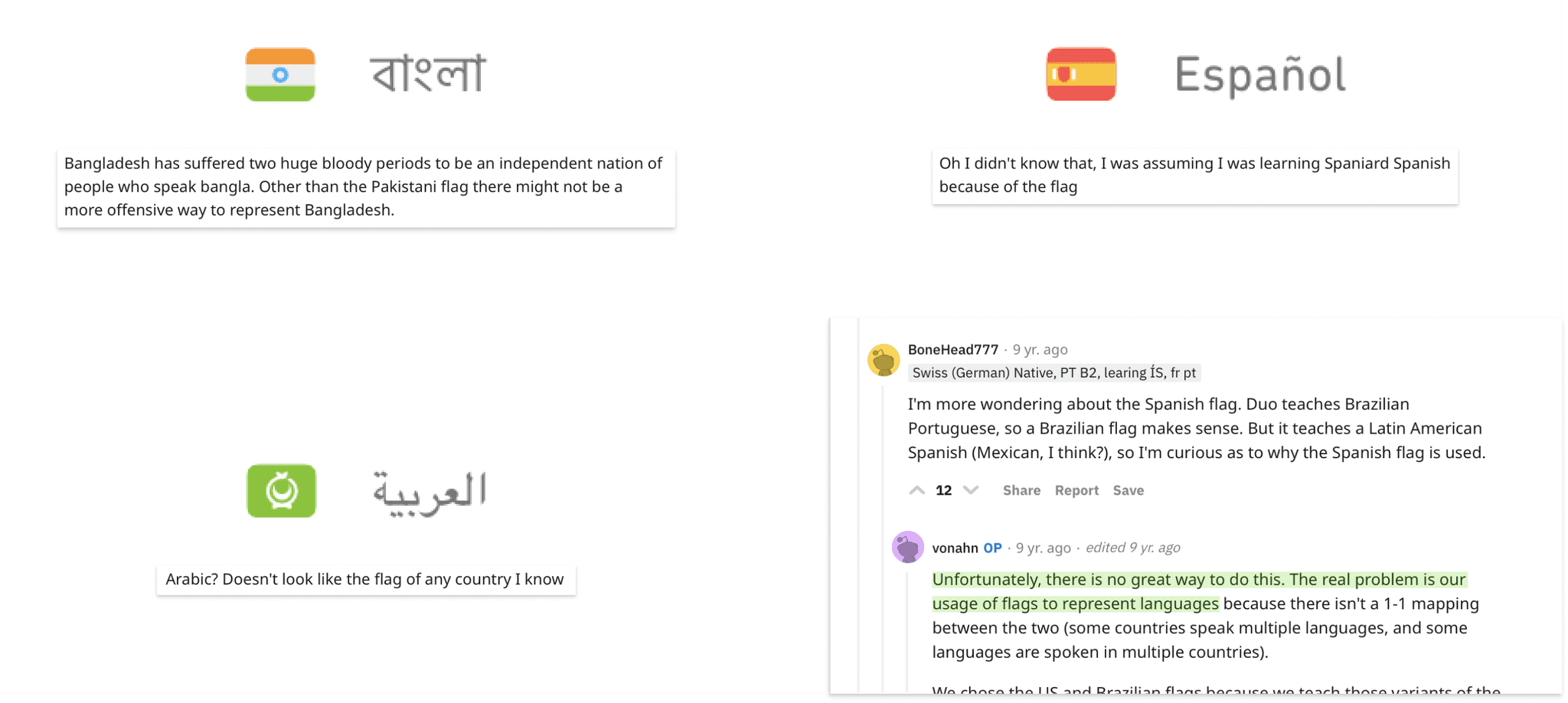
Using flags to represent languages quickly creates problems, which are frequently discussed on r/duolingo:
This practice can be exclusive and culturally insensitive due to colonialism and historical conflicts.
It can confuse users who (logically, but incorrectly) interpret the flag to mean Duolingo’s course teaches a particular dialect.
Using unspecified flags that many people can’t identify doesn’t help with course recognizability, nor does it educate users about the speakers of the language.
The CEO of Duolingo has recognized that this system is flawed.
Given that Duolingo takes other steps to increase representation and inclusivity on their platform (like updating its characters to avoid stereotypes), it’s time to give flags another look.
How can we use flags to highlight language speakers’ diversity rather than minimize it?
Increasing representation: illustration
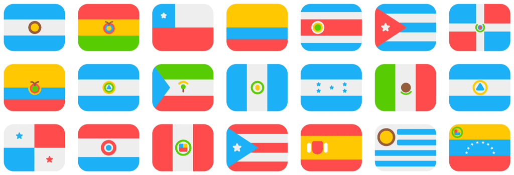
I was curious what Duolingo could look like if it expanded the number of flags (and countries) it acknowledges on the platform, so I illustrated the flags of the 20 countries whose official language is Spanish in addition to Spain.
Over multiple iterations, I created flags for more Spanish-speaking countries in Duolingo’s recognizable illustration style.
Inclusivity vs. scalability: why not both?
I tried to explore ways that flags could serve as visuals in the course selection process, but I ran into the challenge of inclusivity vs. scalability. I could choose the flag with the highest number of speakers (left), but that was barely more inclusive than the current system. On the other hand, representing every relevant flag would be impossible given the number and variation by language (middle).
With that in mind, I removed flags from the course selection process and used the name of the language, which is the most inclusive option (right). However, the variation in length of language names still presents a scalability issue, especially on mobile.
Using national flags to represent courses becomes impossible when you try to be inclusive, so I used typography instead.
A standardized display for langauges
Luckily, there is already a standardized code to represent virtually every language with a uniform length: ISO-639 codes.
These codes could easily be displayed in Duolingo’s style and in the same size as existing flags, making this change immediately implementable without affecting the rest of the app.
ISO-639 codes are created by the International Organization for Standardization, an international body with representation from 169 member countries.
Using flags to highlight diversity
While I removed flags from the course selection process, I knew they still had value elsewhere on the platform. Even though they shouldn’t represent languages, they can still be an engaging visual to represent countries.
Duolingo’s course content already makes plenty of references to specific countries, but they mostly reference the countries whose flags are already on the platform.
To demonstrate what more inclusive representation would look like, I added a wider variety of flags throughout course content, and even in loading screens.
Adding more flags and cultural references to course content introduces learners to the diversity of speakers that many languages have, enhancing their educational experience while increasing representation.
Duolingo Max = more opportunity
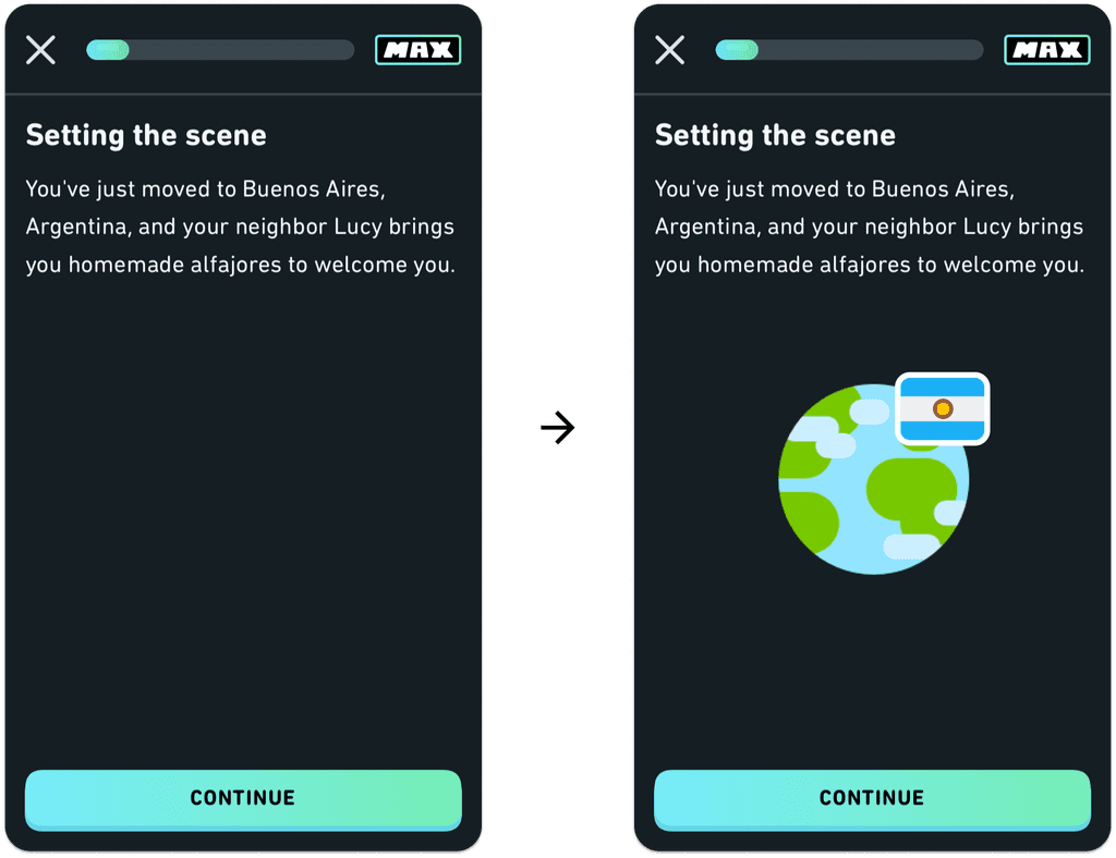
The release of Duolingo Max introduced Roleplay, which provides learners with AI-generated conversational situations. The current Roleplay feature references a specific country every single time (even though most of the Spanish ones take place in Madrid, Spain), creating even more opportunities to educate learners about national, cultural, and linguistic diversity.
Why not take the opportunity to fill some of that blank space to show users where they are?
Measuring success
Replacing course selection visuals could be done immediately, and the change could be A/B tested against the current interface to ensure that it doesn’t negatively affect usage. In addition, it would be important to conduct qualitative research to better understand the reactions that different learners could have to this change, and whether it truly feels more inclusive and more logical.
Increasing the use of flags in course content (and illustrating flags to represent a wider variety of countries) would have to be done over time, but it could be tested in the same way.
Reflection
I’ve revisited this project a few times as the platform has changed, and it’s been fun to work in Duolingo’s colorful design language. It’s also an interesting challenge to consider changes to an established, robust system—when to follow rules, and when to break them in favor of something new.
