Connecting farmers and customers during the pandemic
Timeline
Spring 2020 - Winter 2021
My Role
I was the sole UX designer on the project and helped manage the team from conception to post-launch. I worked with closely with 8 engineers on implementation and the director of our nonprofit partner on strategy. I led design, prototyping, usability testing, and feature prioritization.
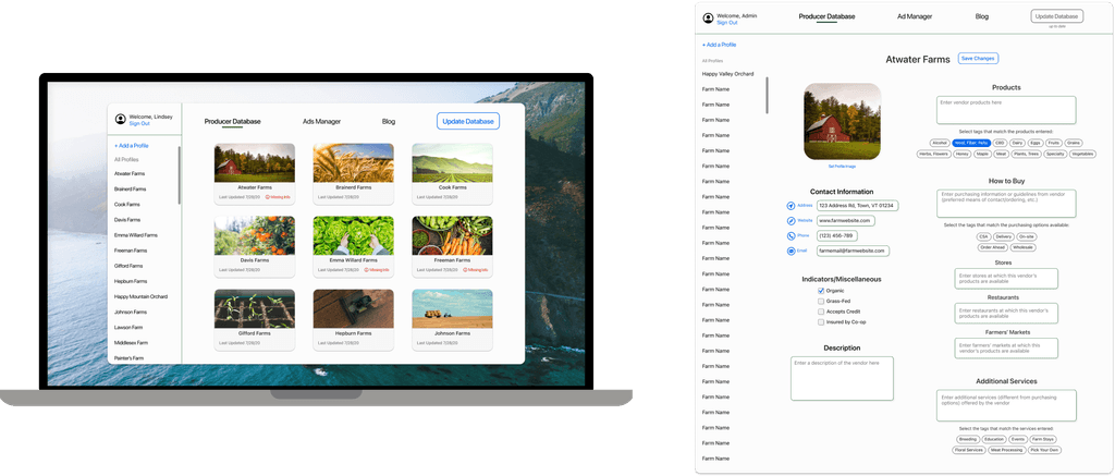
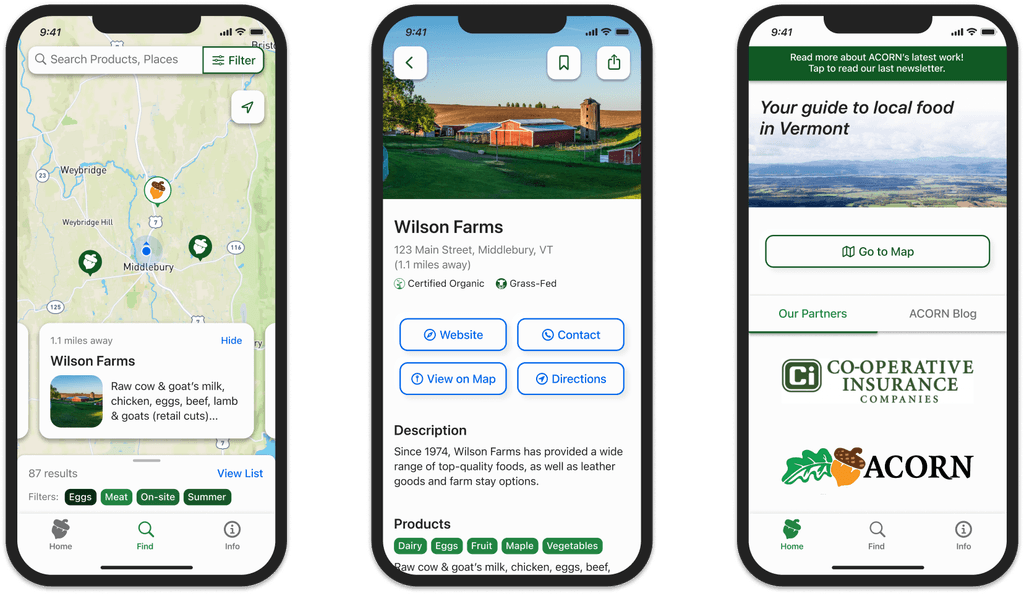
Final deliverables: a cross-platform application (top) and content management system for easy administration (bottom).
Context: pandemic closures devastated local farmers
COVID-19 lockdowns closed Vermont farmers' markets, threatening local farmers (especially those without an online presence). I joined a local agricultural nonprofit called ACORN VT and built a team of students to create a way for customers and farmers to find each other online.
Project and deliverables
I designed and shipped a map-based mobile app allowing customers to discover farms, browse their products via search and filter, and contact them directly.
I also created an content management system for the nonprofit to manage the 300+ farm listings we onboarded onto the platform.
After launching the mobile app, I designed tablet and web versions and handed them off to a developer.
Impact
Our app, Eat Local VT, was downloaded 1,100+ times on iOS and Android and made small farmers discoverable when COVID-19 disrupted their primary means of doing business.
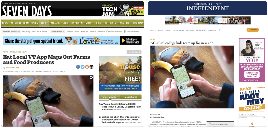
The app received news coverage around the county and sparked conversations about statewide collaboration between agricultural organizations.
News coverage of the app’s release in February 2021.
Identifying our users
When we met on Zoom to figure out how to approach this problem, the first thing I did was to learn what I could about who we would be designing for.
With ACORN’s help, we sent a survey to their mailing list and learned that our primary audience of local food shoppers would be 40 to 60+ year-old users on iOS.
Given these insights, I decided to focus on simplicity and familiarity in my designs so that a wide range of people could easily use our system.
How can we help a wide range of Vermonters find and support local farms online?
Getting started quickly with inspiration from map apps
Moving fast was the name of the game here—small businesses were on the line. I knew that we wanted to create an online directory of sorts where people could find farms, and I drew inspiration from popular map-based apps that could provide a familiar structure.
Apps like Maps, Airbnb, and Yelp helped me get started ideating quickly, but I recognized that even these apps were too complex.
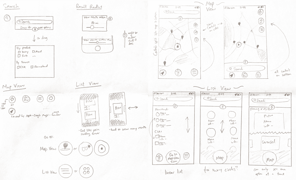
ACORN needed a stripped-down system that non-power users could learn fast; I began sketching ideas for the interface, putting aside features that wouldn’t directly help customers get in touch with farms.
Early sketches of Eat Local VT exploring different navigation options. I decided to stick with tried-and-true patterns from popular map apps for easy adoption.
Iterating quickly
While the engineers were developing a backend, I moved into Figma and began designing. Together, we worked as efficiently as we could to build an MVP that we could test with real people.
Early prototypes that I created to help the engineers build our MVP.
Validating design decisions
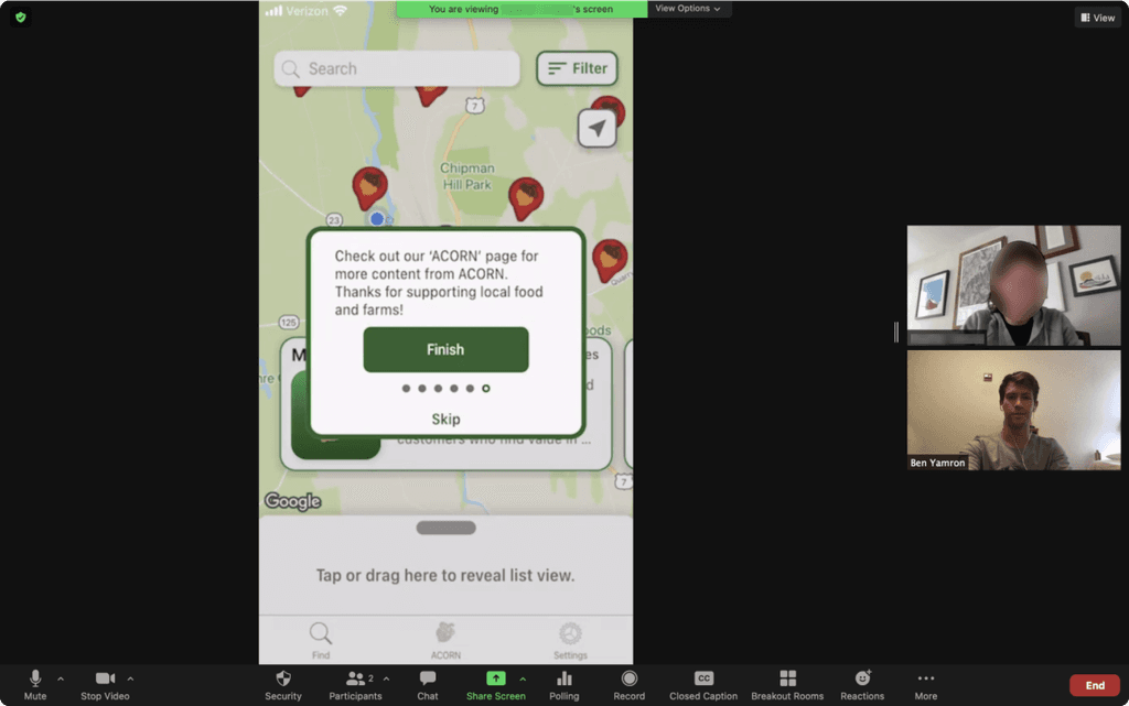
When we had created a basic functional product, I ran a series of usability tests via Zoom. I made sure to test with across a wide age range (25-65), and I focused on testing core features and ease of navigation.
I conducted moderated usability tests from my dorm room, testing core flows like onboarding and search.
Keeping it simple to maximize user success
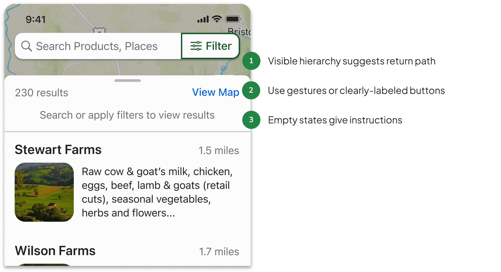
One of the major iterations driven by feedback from usability tests was the addition of intentional redundancies within the interface to prevent users from getting stuck while navigating between sections of the app.
Older users, in particular, expressed that they were unlikely to keep using the app if they ran into any trouble navigating. With this in mind, I designed subtle hints to direct users to key actions and provided multiple paths to success.
Designing across platforms
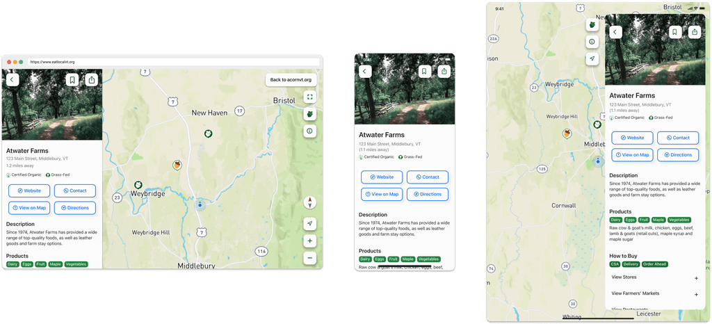
While we prioritized the mobile version of the app, I spent time adapting the core experience to tablet and web as well.
Given our limited capacity as full-time students, I created components that worked across all three platforms to speed up implementation.
Building systems for consistency
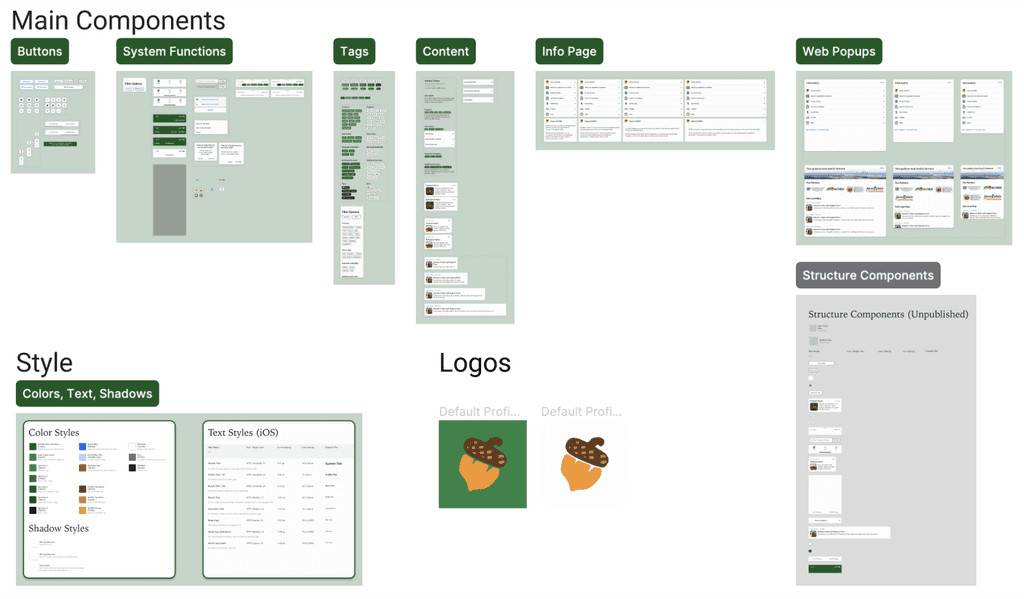
As I was building prototypes for web, tablet, and mobile, I created a component library and style guide to act as a source of truth for consistent appearance and behavior across platforms.
This UI kit helped me expand the app to other platforms, and it served as a resource for engineers to reference component specs.
Creating a seamless experience for administrators
The management of all of the farms in the database was already done by ACORN themselves, so I designed an online content management system for managers to add and edit listings, manage ads, and upload blog posts.
The profile editor matched the structure of the consumer-facing app to make adding and updating farm profiles easy.
Discovery, contact, and community
The app that we shipped had three main sections: a map and list-based browsing section to easily find specific farms, products, and services through searching and filtering; profile pages to easily contact individual farms; and a home page for local advertising and access to ACORN’s blog and newsletter.
Eat Local VT provided a modern, map-based app interface while simplifying functionality down to the essentials that a wide range of users could learn quickly.
Reflection
This project was really my introduction to the design field, and it taught me an incredible amount about how to create a functional multi-part system. I learned valuable lessons about collaborating with engineers and justifying my design decisions with data.
If I could do it all again, I would have liked to conduct more robust initial research and explore more novel directions, but given the situation and the urgency we felt to help our community. I’m very proud of what we did.


