Kickstarting an early-stage design system
Timeline
Summer 2023 - Spring 2024
My Role
I led component design, receiving regular critique from a design team of 10. I collaborated with other teammates on technical implementation.
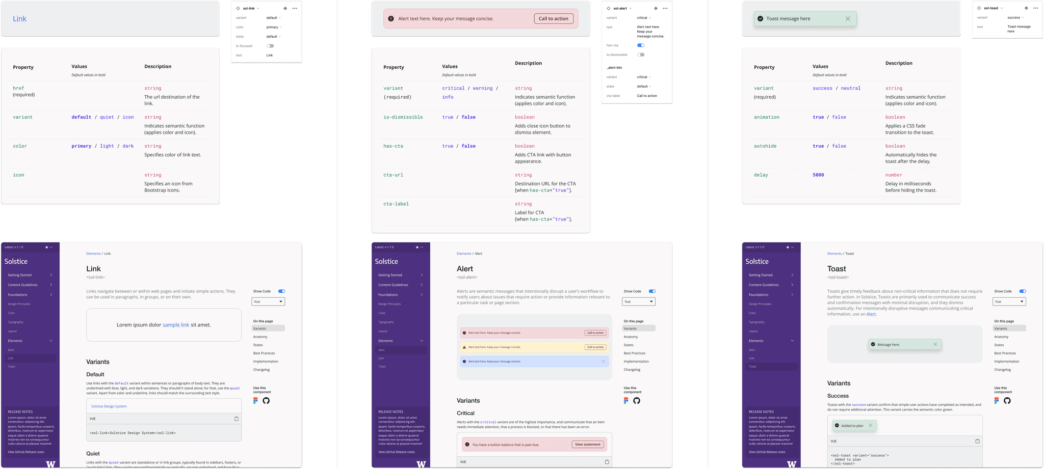
The first three components of the design system, designed and documented in Figma and in code.
Context
UW Information Technology manages digital services for over 90,000 students, faculty, and staff. The UX team was beginning to build a design system to make their extensive application suite more cohesive and to improve collaboration among teams using different development stacks and processes.
I joined the team to design the system's first components, initiating a new phase of system development.
Project and deliverables
I designed the first 3 components for the design system—Links, Alerts, and Toasts. I delivered these components in Figma and worked with technical leads to implement them in code.
I created the component documentation template that will be used by the UX team to implement documentation pages for the rest of the system.
I led the first implementation of the new design system, redesigning an identity application serving 50,000+ students.
Impact
My work helped the team codify and streamline a scalable component design process. I helped establish clearer standards for component documentation and initiated the implementation of the system within UW digital applications, which will deliver a more cohesive, more accessible user experience to tens of thousands of people within the UW community.
Complementary components
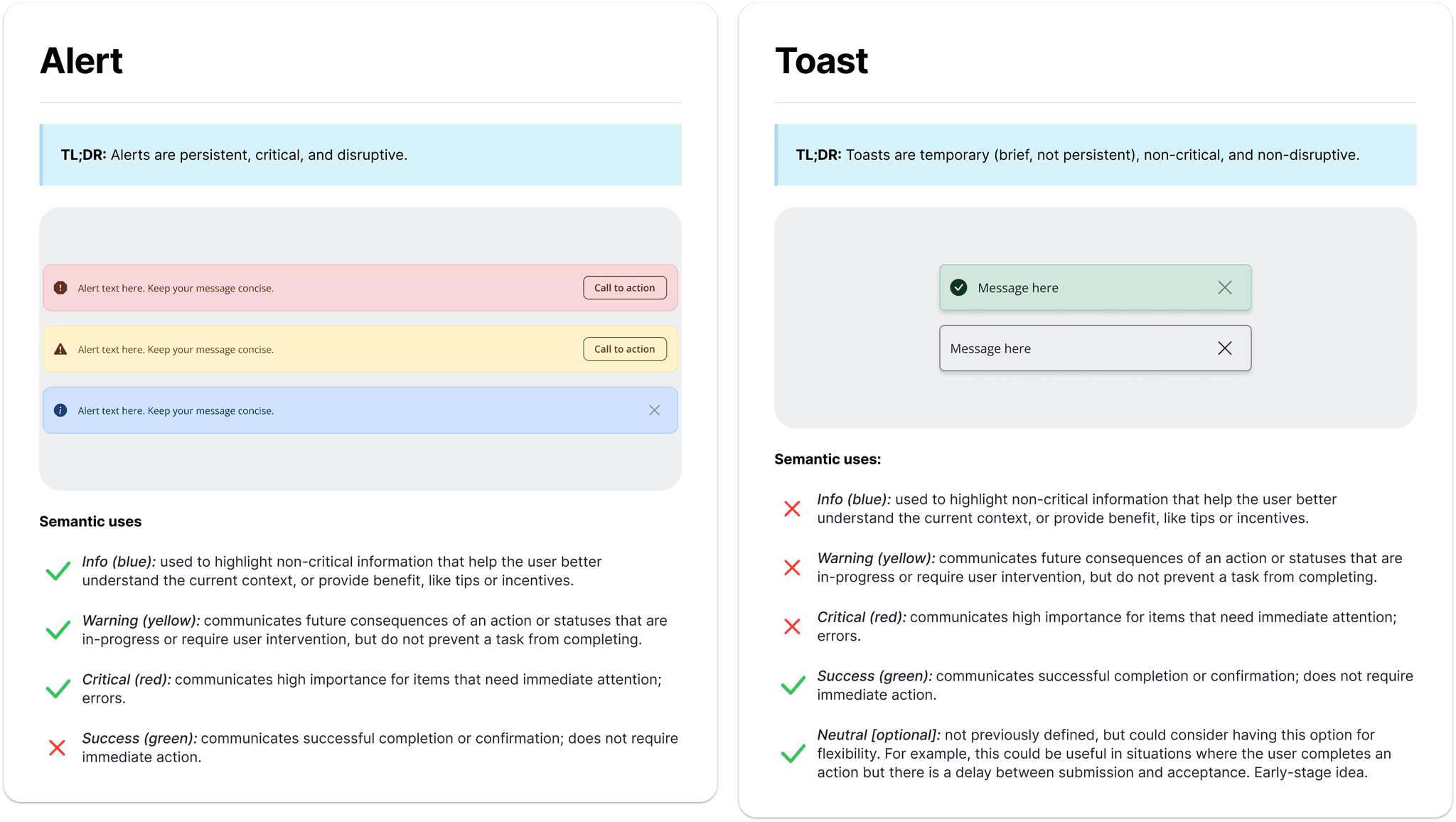
Throughout the project, I considered how components would work together. For example, I designed Alerts and Toasts to notify users, but I clearly distinguished their use cases: Alerts were for errors, warnings, and announcements, while Toasts were for confirmation messages.
While usage of Alert banners and Toasts can sometimes overlap, the clear distinction made designers and developers across teams more likely to implement the components properly and consistently.
The disruptive Alert pattern drew attention to the most important messages that required action, making them harder to miss. Toasts gave frequent feedback without cluttering the interface with persistent notifications.
Early working versions of the documentation for the Alert and Toast components, which I designed to work in tandem with one another from the beginning.
Accessible patterns
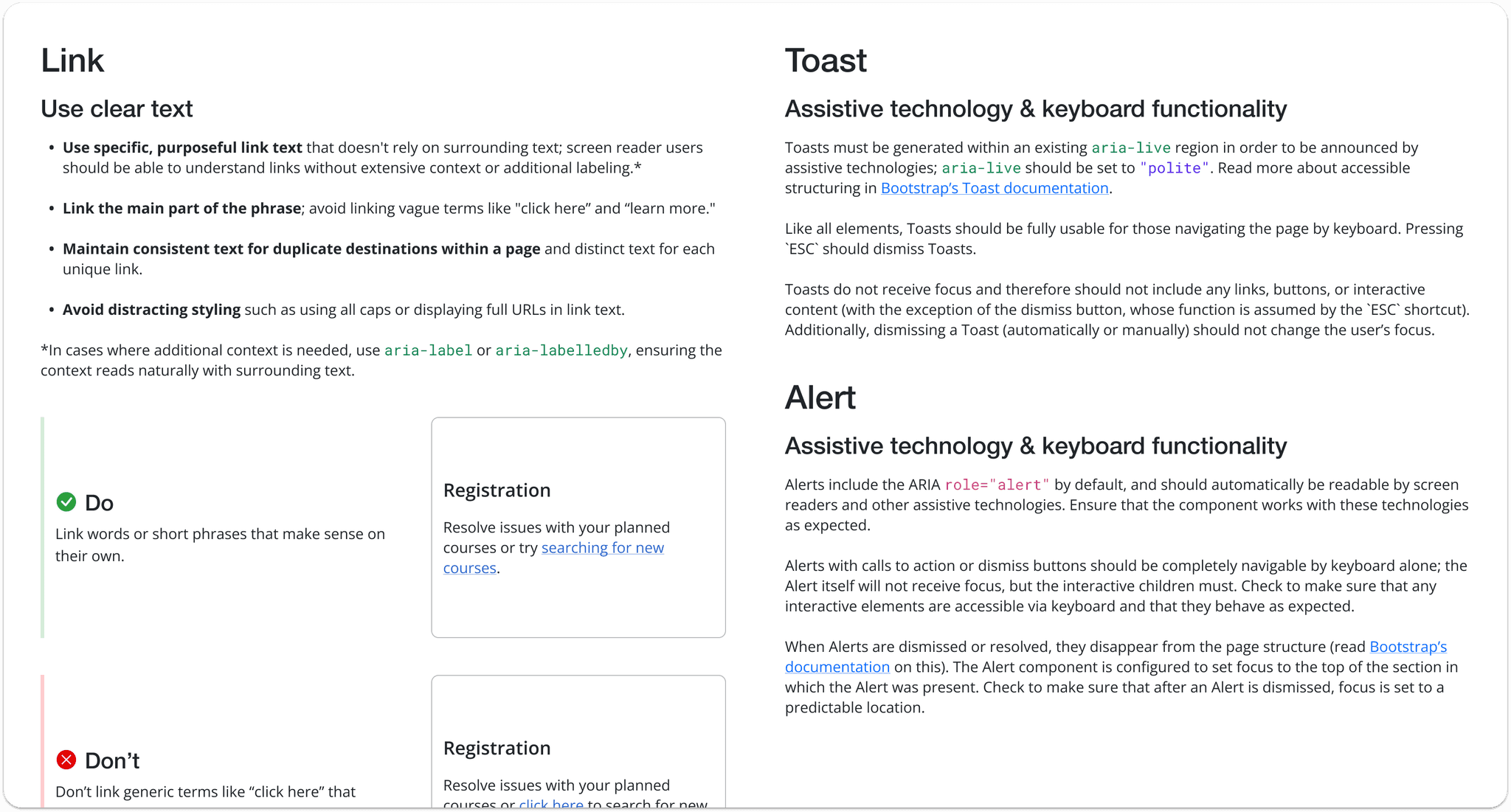
Working with the technical lead on the UX team, I made my components were aligned with Web Content Accessibility Guidelines (WCAG) for an accessible experience. This included making visual design decisions like contrast and text size, as well as defining implementation guidelines around ARIA roles and keyboard interactions.
Excerpts of documentation on accessibility best practices for the three components, including both technical and practical guidelines.
Embracing technical constraints
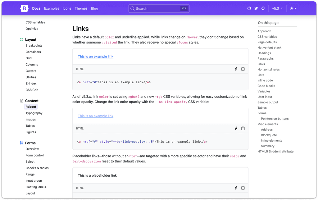
One of the early course corrections I made with the help of the team while designing the Links component was aligning to the Bootstrap framework, which the team already used to build components.
Using Bootstrap as a starting point rather than ideating from scratch helped me speed up my design time by 60%. It also helped me be more thoughtful about designing specific features that departed from Bootstrap to serve our specific needs.
Using this strategy, the team was able to implement the components much faster than if they had to build them from scratch.
Bootstrap's documentation on their Links component, which served as a guide for my design.
Alerts: helping users solve problems with calls to action
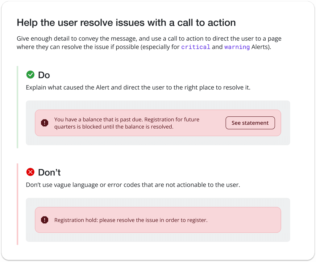
One example of a design departure from Bootstrap was building a Call to Action property into the Alert component. Without a call to action, there was no simple way to direct users to the root of the problem that caused the alert; we wanted to help users help themselves.
While adding a CTA property increased development time, it provided a worthwhile benefit to end users and clear guidance to developers.
A documented example of a call to action button in the Alert component, which helps developers guide users to necessary actions.
Adaptable documentation for designers and developers
To better understand how designers and developers from UW-IT would use the system, we conducted interviews with engineers from multiple teams who had different levels of familiarity with design systems. We mapped out user flows for these users as well as the designers on our team.
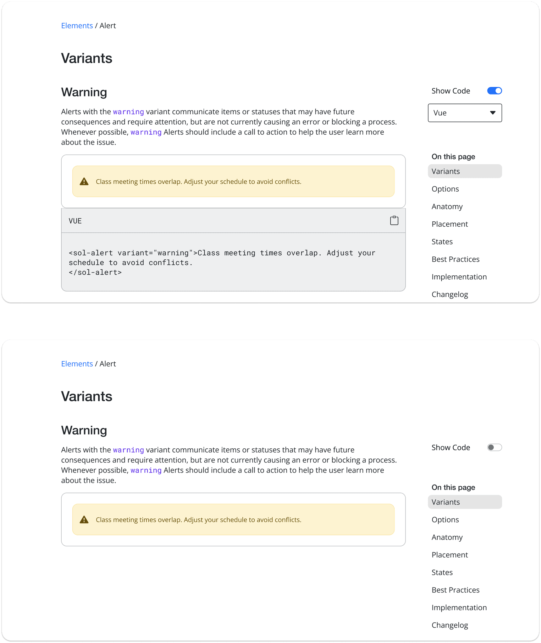
With these insights, I designed a component documentation template with features like hideable code snippets to make the page more scannable for different groups of users. With this feature, engineers could easily copy and paste code, while non-technical designers could hide the code and focus on the written guidelines.
Top: an excerpt from The Alert documentation featuring visible code snippets.
Bottom: the same documentation with code hidden, providing a more streamlined reading experience.
Documentation with room to grow
In the early stages of the design system, we were building components in Vue for our team. However, we knew that when the system was released, other teams with different stacks would want to translate the components for their own use.
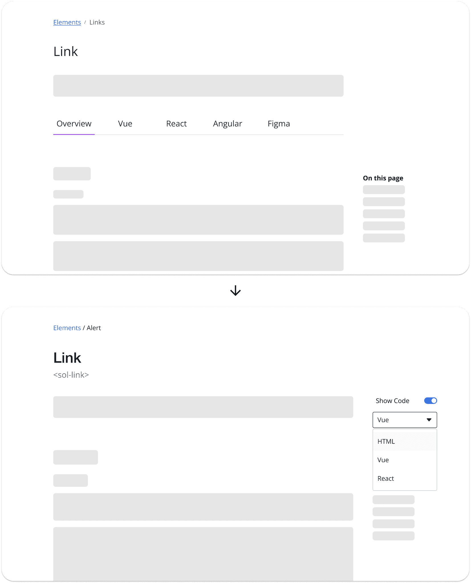
With this in mind, I iterated on the documentation layout, changing navigation from one tab for each framework (not easily scalable as we added support for more libraries and frameworks) to a framework selector dropdown with integrated code snippets on a single page (easily scalable and expandable).
The code selector dropdown reduced the need to separate tabs, making all documentation easily findable on one page.
Process changes
Through regular check-ins with the team, I shared my experience building the first components and discussed strategies for designing components more efficiently. We implemented process improvements like turning research directly into documentation, aligning to Bootstrap early, and creating clear checkpoints for component approval from the team.
Reflection
Design systems work is long and complex, but extremely rewarding when done well. I learned that embracing technical constraints early can be a key to working smarter and getting things off the ground.
Working with the team, I enjoyed uncovering obstacles, challenges, and bottlenecks to make the component design process more efficient in the future.

